Tidepool Loop
Imagine for a moment that you have Type 1 Diabetes – an incurable autoimmunine disease.
It requires constant balancing of what you eat, how you exercise, and how much insulin to inject into yourself in an attempt to keep your Blood Glucose "in range".
Too far in either direction can lead to unconcsiousness, coma & death in a matter of hours...
Excruciatingly
Slow & Steady
There have been three major quality-of-life improvements for Type 1 Diabetics in the past 100 years:
The Next Step...
In the Summer of 2018, the lead developer for the Loop project approached Tidepool (the non-profit I was lead designer for) and asked if we could help turn it into a commerically available, FDA-approved application.
In addition to expanding the design team in order to add the skills needed to bring a Class-II "Device" to market, I led work in the below areas:
Building the building blocks
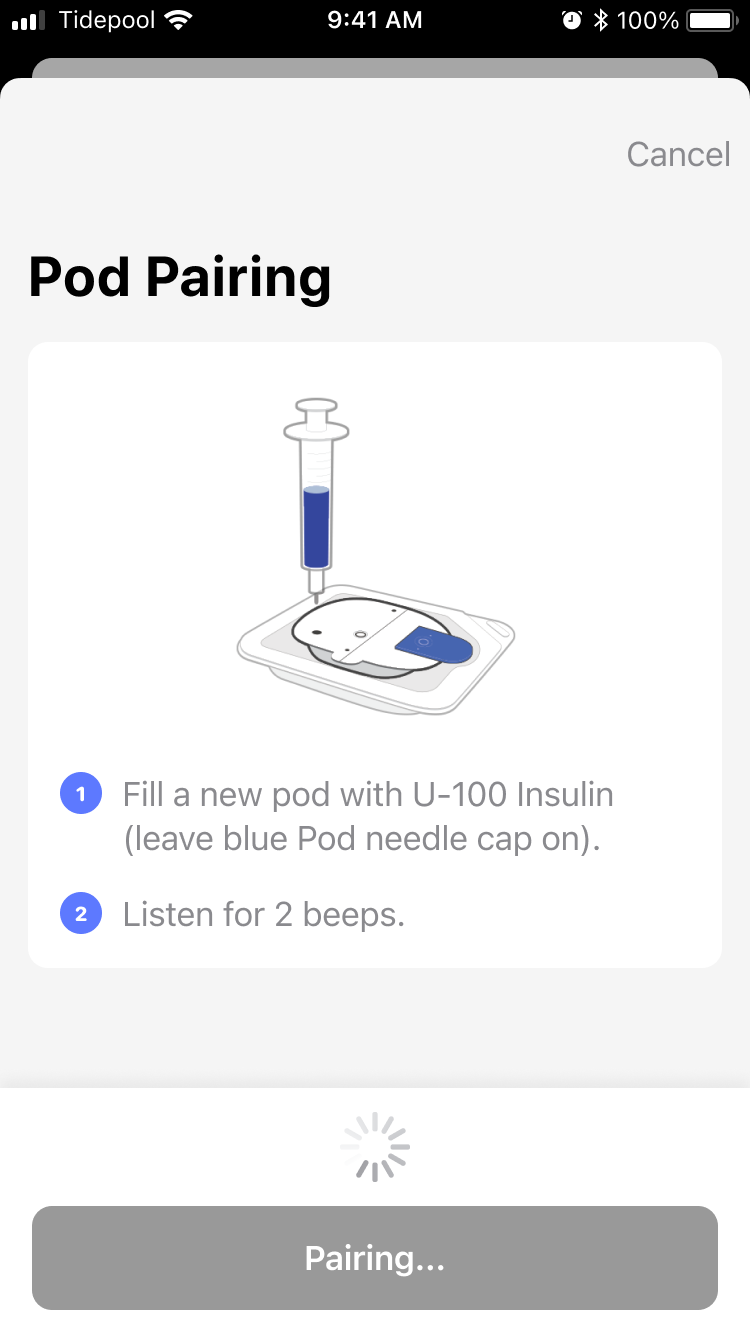
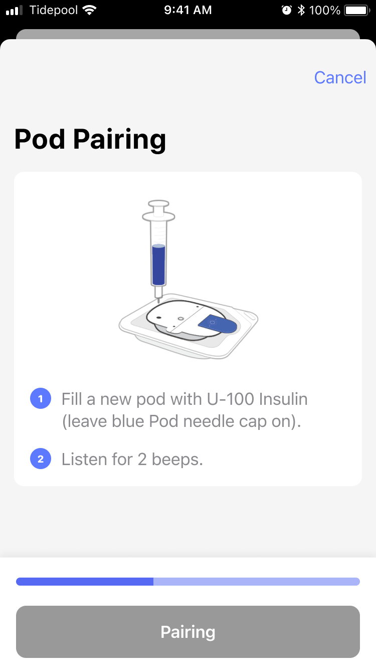
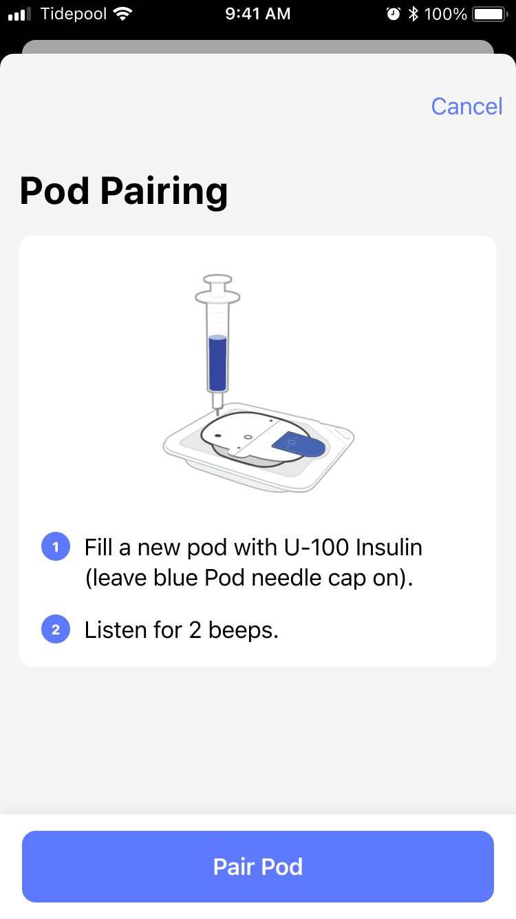
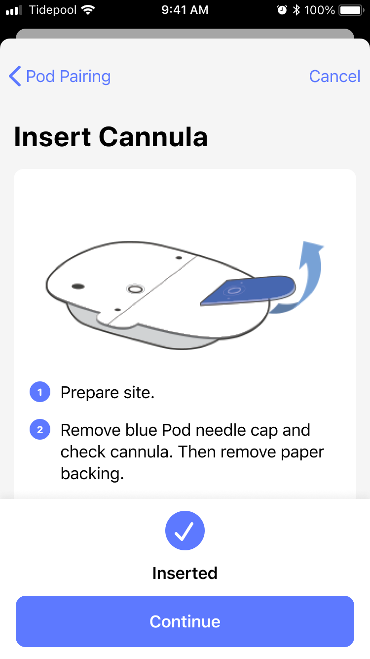
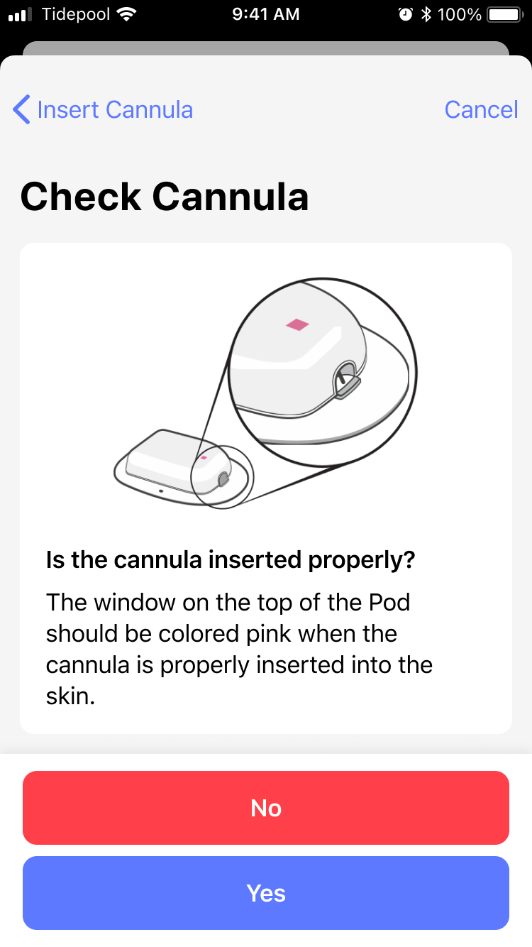
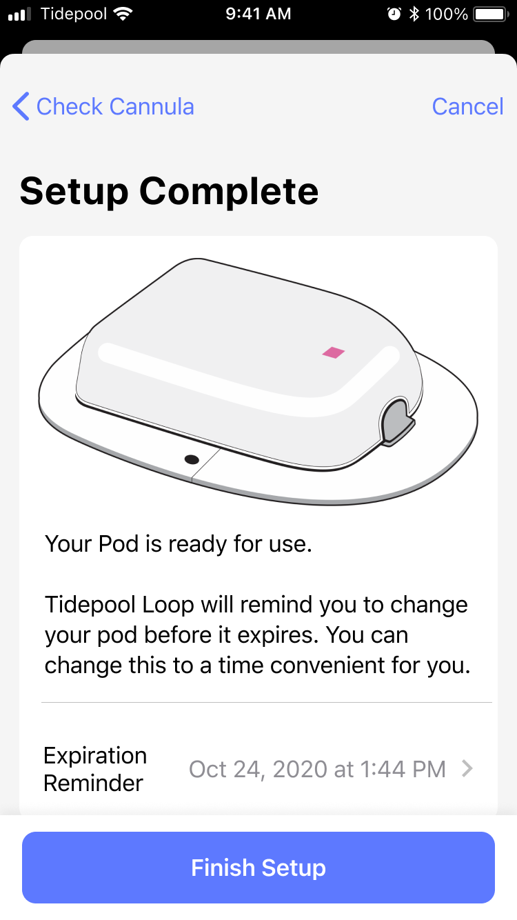
Tidepool partnered with medical device manufacturers, rather than reverse engineering their devices. This meant integrating a number of discrete physical devices, along with thier setup proceedures, error states, and status information into a singular User Experience.
I kicked off explorations of how to adapt the existing open-source interface into something that would scale with the projects now-increased complexity.
Thinking Spatially
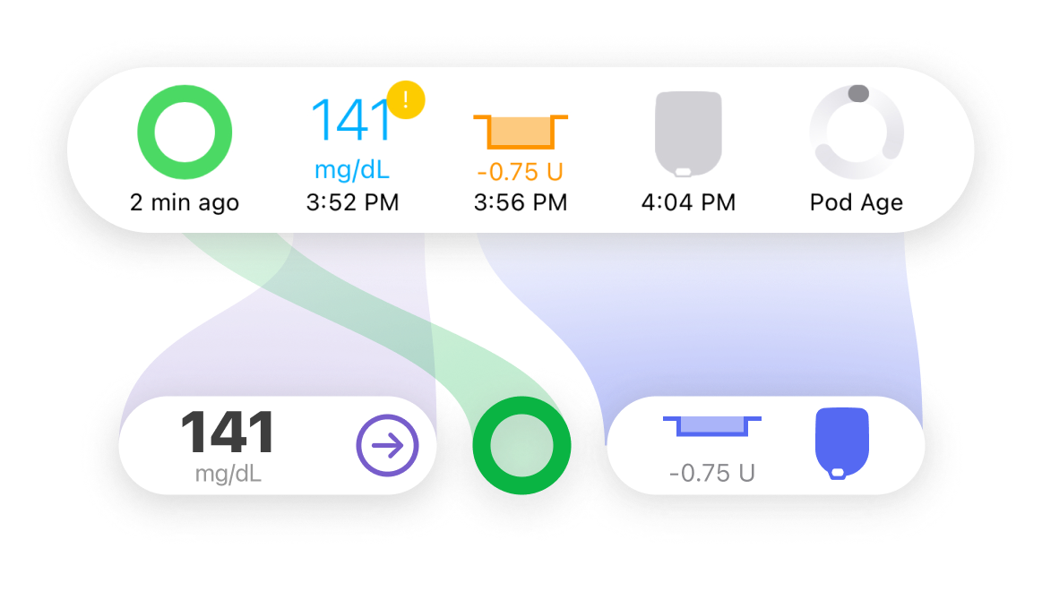
I coordinated rapid prototyping and user testing of the redesigned Status Bar, systematically reducing the information present on the Home Screen of the app to make it more glanceable.
Info that didn’t earn it’s place on the home screen (verbose error messages, transient status updates) were given room to be clearly explained by being moved one tap away, inside of the newly designed “Device” screens.
Clear calls to action
Via rapid prototyping and user testing, I coordinated the redesign of the Status Bar, systematically reducing the information present on the Home Screen of the app to make it more glanceable.
Info that didn’t earn it’s place on the home screen (verbose error messages, transient status updates) were given room to be understood by being moved one tap away, inside of the newly designed “Device” screens.
Because Tidepool Loop acts as coordinator for each device, it was important to establish a clear hierarchy for error states, communicating which device was experiencing which problem.
Beyond just conveying the error, we also incorporated initial troubleshooting steps without requiring a visit to the relevant support documents.
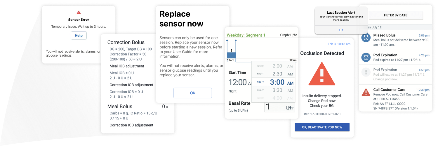
A sampling of the various & verbose error messages
Attention to detail
Wherever possible, we relied on platform iconography in order to maintain fit and finish with the Mobile OS.
When specialized icons were needed for diabetes-specific concepts, I expanded upon the SF Symbols icon set while retaining the unique characteristic of our partner's devices.
Beyond the bar...
While the Status Bar was a cornerstone piece of user experience on which we built the rest of the app, it was far from the only work I did.
I also lead work on:
- User Onboarding, a natural fit given my work with the Material Design team while at Google
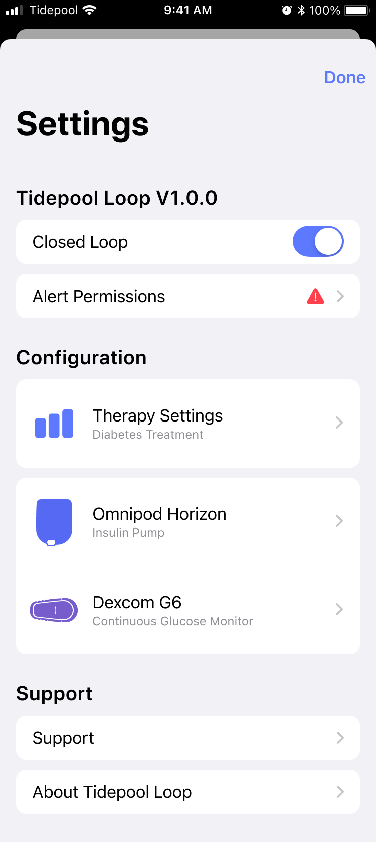
- General Settings Information Architecture, UX & UI. This was tightly interwoven with the Status Bar work
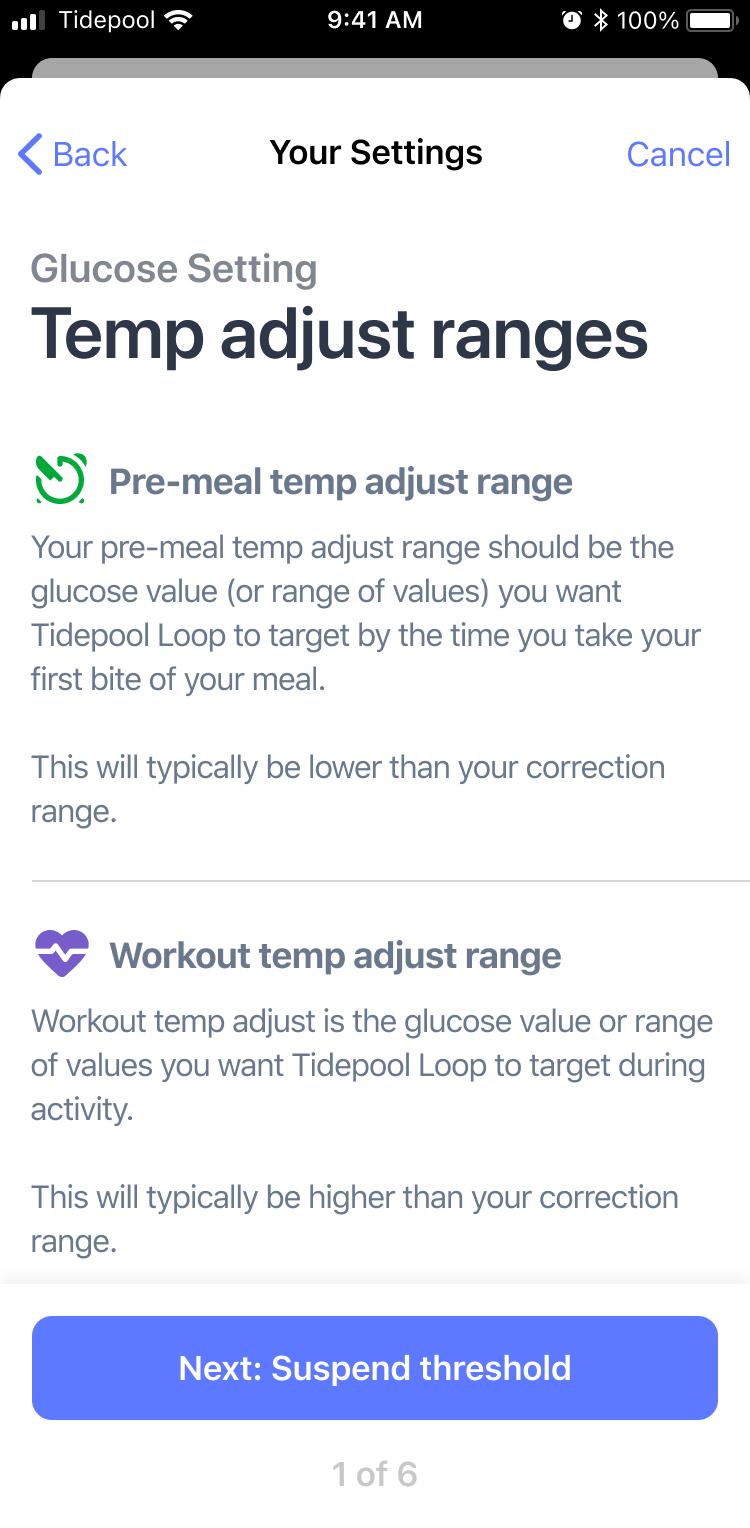
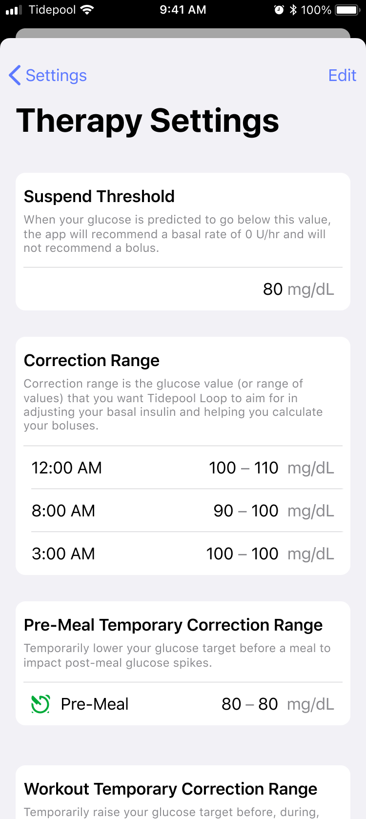
- Diabetes Therapy Settings – a great learning experience where I collaborated with Medical Advisors on FDA regulations
- Data Visualization and Charting, exploring how to incorperate relevant data to help users make decisions for themselves, in context.
Please reach out if you're interested in hearing more about any of my prior work!
© Paul Forgione 2023
